
A tertiary color is a color made by mixing full saturation of one primary color with half saturation of another primary color and none of a third primary color, in a given color space such as RGB, CMYK (more modern) or RYB (traditional).
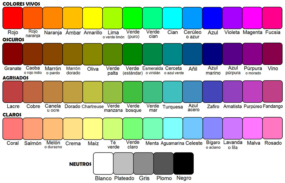
Tertiary colors have general names, one set of names for the RGB color wheel and a different set for the RYB color wheel. These names are shown below.
Another definition of tertiary color is provided by color theorists such as Moses Harrisand Josef Albers, who suggest that tertiary colors are created by intermixing pairs of secondary colors: orange-green, green-purple, purple-orange; or by intermixing complementary colors. This approach to tertiary color relates specifically to color in the form of paints, pigments and dyes.
RGB or CMY primary, secondary, and tertiary colors
Primary, secondary, and tertiary colors of the RGB color wheel
The primary colors in an RGB color wheel are red, green, and blue, because these are the three additive colors—the primary colors of light. The secondary colors in an RGB color wheel are cyan, magenta, and yellow because these are the three subtractive colors—the primary colors of pigment.
The tertiary color names used in the descriptions of RGB (or equivalently CMYK) systems are shown below.
cyan + blue = azure
blue + magenta = violet
magenta + red = rose
red + yellow = orange
yellow + green = chartreuse
green + cyan = spring green
Traditional painting (RYB)
The primary colors in an RYB color wheel are red, yellow, and blue. The secondary colors — orange, green, and purple — are made by combining the primary colors.
In the red–yellow–blue system as used in traditional painting and interior design, tertiary colors are typically named by combining the names of the adjacent primary and secondary.
red + orange = vermilion (red-orange)
orange + yellow = amber (yellow-orange)
yellow + green = chartreuse (yellow-green)
green + blue = teal (blue-green)
blue + purple = violet (blue-purple)
purple + red = magenta (red-purple)
Tertiary- and quaternary-color terms
The terms for the RYB tertiary colors are not set. For the six RYB hues intermediate between the RYB primary and secondary colors, the names amber/marigold (yellow–orange), vermilion/cinnabar (red–orange), magenta (red–purple), violet/indigo (blue–purple), teal/aqua (blue-green), and chartreuse/lime green (yellow–green) are commonly found. The names for the twelve quaternary colors are more variable, if they exist at all, though indigo and scarlet are standard for blue–violet and red–vermilion.
In another sense, a tertiary color is obtained by mixing secondary-colored pigments. These three colors are russet (orange–purple), slate (purple–green), and citron (green–orange), with the corresponding three quaternary colors plum (russet–slate), sage (slate–citron), buff (citron–russet) (with olive sometimes used for either slate or citron). Beyond that are shades of grey (blue grey and brown greys), which approach but never quite reach black.
The RYB color terminology outlined above and in the color samples shown below is ultimately derived from the 1835 book Chromatography, an analysis of the RYB color wheel by George Field, a chemist who specialized in pigments and dyes.
Comparison of RGB and RYB color wheels
Unlike the RGB (CMY) color wheel, the RYB color wheel has no scientific basis. The RYB color wheel was invented centuries before the 1890s, when it was found by experiment that magenta, yellow, and cyan are the primary colors of pigment, not red, yellow, and blue.
The RGB (CMY) color wheel has largely replaced the traditional RYB color wheel because it is possible to display much brighter and more saturated colors using the primary and secondary colors of the RGB (CMY) color wheel. In the terminology of color theory, RGB color space (CMY color space) has a much larger color gamut than RYB color space.
Perception of secondary and tertiary colors
Secondary or tertiary colors juxtaposed seem more saturated to the eye. This is called simultaneous contrast. Some contrasts such as the ratio of red to green tend to widen the space, while the contrast of non-secondary colors for example from blue to yellow, blue to green tend to flatten the perceptual space, so we speak of contrast of hue.
Historical
The notion of secondary color is attested in 1750, in an article directed against Newton’s color theory. According to the author’s Aristotelian views, the colors derive from the mixture of white light and darkness; “Blue, red, and yellow, which were formerly taken for primitive colors, are now only secondary colors.” These polemical views are apparently opposed to those of professionals, given by Brongniart in 1778:
“The Dyers distinguish five colors which they call primitive or primitive, because they serve to make all the colors secondary or derived. These five colors are blue, red, yellow, fawn and black. ”
In the same way that primary colors can be called “primitive”, secondary colors are sometimes called “composed”. Dyers and painters know two kinds of colors, those that can not be obtained by mixing, and the others.
The secondary color “formed by the union of different primitive rays” of colored lights is found in 1842.
The graphic artist Charles Ernest Clerget publishes in 1844 six letters on the theory of colors. He was inspired by the work done by M. Chevreul in 1840 and 1842, but he thought it his duty to bring some ideas and some personal experiences to it. He exhibited a system of primary, secondary and tertiary colors, in which he reserved the term “binary” for the equal mixture of two “simple colors”. From these definitions, he sketches a numerical classification of colors by quantity of red, yellow and blue.
These systematic classifications, well adapted to the printing press, have more influenced the decorative arts than the painters.
Source From Wikipedia