
Illumination is an important concept in visual arts. The illumination of the subject of a drawing or painting is a key element in creating an artistic piece, and the interplay of light and shadow is a valuable method in the artist’s toolbox. The placement of the light sources can make a considerable difference in the type of message that is being presented. Multiple light sources can wash out any wrinkles in a person’s face, for instance, and give a more youthful appearance. In contrast, a single light source, such as harsh daylight, can serve to highlight any texture or interesting features. Processing of illumination is an important concept in computer vision and computer graphics.
Chiaroscuro, in art, is the use of strong contrasts between light and dark, usually bold contrasts affecting a whole composition. It is also a technical term used by artists and art historians for the use of contrasts of light to achieve a sense of volume in modelling three-dimensional objects and figures. Similar effects in cinema and photography also are called chiaroscuro.
Further specialized uses of the term include chiaroscuro woodcut for coloured woodcuts printed with different blocks, each using a different coloured ink; and chiaroscuro drawing for drawings on coloured paper in a dark medium with white highlighting.
The underlying principle is that solidity of form is best achieved by the light falling against it. Artists known for developing the technique include Leonardo da Vinci, Caravaggio and Rembrandt. It is a mainstay of black and white and low-key photography. It is one of the modes of painting colour in Renaissance art (alongside cangiante, sfumato and unione). Artists well-known for their use of chiaroscuro include Rembrandt, Caravaggio, Vermeer, and Goya.
The technique is also imposed between manieristas, examples of this use the Last Supper of Tintoretto or Portrait of two, which bodes compositions Rembrandt. The Dutch painter has been one of the most conspicuous practitioners of chiaroscuro, using light in his composition to highlight only his specific object.
The term Italian chiaroscuro, although apparently means the same, is used more specifically to a technique of etching in woodcut, which through complementary plates gives color to images as if they were painted the watercolor. The first known use of the term, with this meaning, is attributed to the 16th century Italian engraver Ugo da Carpi, who would have taken the idea from compositions of German or Flemish origin. Other engravers who worked on this technique were Antonio da Trento and Andrea Andreani. In Da Carpi’s etchings, the chiaroscuro effect highlights a central figure illuminated by a light source normally absent from the plane of the painting; however, the dark areas are not as accentuated as would come to be seen in the work of the main broadcasters of Chiaroscuro, Caravaggio and Giovanni Baglione.
History
The discovery of Macedonian tombs from 1977 onwards clearly shows proof of a very great mastery of chiaroscuro by the greatest painters of ancient Greece. In this, Hellenistic Greek art differs from paintings without chiaroscuro which preceded: the black-figure ceramics and those with red figures, graphic solutions more than pictorial, which constitute the main part of the Greek paintings currently preserved. The figures are traced there, by incised, engraved or painted lines and large flatblacks constitute either the form or the background. Chiaroscuro is, on the other hand, visible in Hellenistic paintings with a modeling by nuanced colors and by hatching, according to a method very different from the modern era: as can be seen on the arm of Persephone, in the Vergina’s grave.
Origin in the chiaroscuro drawing
The term chiaroscuro originated during the Renaissance as drawing on coloured paper, where the artist worked from the paper’s base tone toward light using white gouache, and toward dark using ink, bodycolour or watercolour. These in turn drew on traditions in illuminated manuscripts going back to late Roman Imperial manuscripts on purple-dyed vellum. Such works are called “chiaroscuro drawings”, but may only be described in modern museum terminology by such formulae as “pen on prepared paper, heightened with white bodycolour”. Chiaroscuro woodcuts began as imitations of this technique. When discussing Italian art, the term sometimes is used to mean painted images in monochrome or two colours, more generally known in English by the French equivalent, grisaille. The term broadened in meaning early on to cover all strong contrasts in illumination between light and dark areas in art, which is now the primary meaning.
From the Middle Ages to the Renaissance
According to the traditional process in the Middle Ages, still advised by Cennino Cennini (1370-1440), the modeling is done either by saturation of the local color, or by change of color in the shade (the (it) cangiantismo), as one sees it in Giotto’s fresco in Padua. After him, Alberti made the “reception of lights” the third part of the painting, which heralds Leonardo da Vinci by the importance given to shadows. According to André Chastel , for Vinci,“The concern for“ relief ”leads to the sacrifice of color in favor of modeling. But it prepares for the conflict of contour and reflections which begins to formulate early and which ends in (it) sfumato ”.
Daniel Arasse develops this moment when, rather than speaking of “outline”, he evokes the inscription of figures by perspective geometry and its unifying principle, which will be replaced by shadow as a unifying principle of the painting more important than the perspective. And that “true” color is impossible to perceive. The chiaroscuro ((it): chiaroscuro) that we see on a study of drapery from 1500-1508 reaches the polished aspect of the stone, by a complex work with a brush, black ink and gray wash, heightened with white on a light blue washed paper (a light blue wash). From the beginning of the 16th century century, the chiaroscuro drawing is carried out on paper tinted in half-tone, and for the lighter parts with clear highlights.
Chiaroscuro modelling
The more technical use of the term chiaroscuro is the effect of light modelling in painting, drawing, or printmaking, where three-dimensional volume is suggested by the value gradation of colour and the analytical division of light and shadow shapes—often called “shading”. The invention of these effects in the West, “skiagraphia” or “shadow-painting” to the Ancient Greeks, traditionally was ascribed to the famous Athenian painter of the fifth century BC, Apollodoros. Although few Ancient Greek paintings survive, their understanding of the effect of light modelling still may be seen in the late-fourth-century BC mosaics of Pella, Macedonia, in particular the Stag Hunt Mosaic, in the House of the Abduction of Helen, inscribed gnosis epoesen, or ‘knowledge did it’.
The technique also survived in rather crude standardized form in Byzantine art and was refined again in the Middle Ages to become standard by the early fifteenth-century in painting and manuscript illumination in Italy and Flanders, and then spread to all Western art.
According to the theory of the art historian Marcia B. Hall, which has gained considerable acceptance, chiaroscuro is one of four modes of painting colours available to Italian High Renaissance painters, along with cangiante, sfumato and unione.
The Raphael painting illustrated, with light coming from the left, demonstrates both delicate modelling chiaroscuro to give volume to the body of the model, and strong chiaroscuro in the more common sense, in the contrast between the well-lit model and the very dark background of foliage. To further complicate matters, however, the compositional chiaroscuro of the contrast between model and background probably would not be described using this term, as the two elements are almost completely separated. The term is mostly used to describe compositions where at least some principal elements of the main composition show the transition between light and dark, as in the Baglioni and Geertgen tot Sint Jans paintings illustrated above and below.
Chiaroscuro modelling is now taken for granted, but it has had some opponents; namely: the English portrait miniaturist Nicholas Hilliard cautioned in his treatise on painting against all but the minimal use we see in his works, reflecting the views of his patron Queen Elizabeth I of England: “seeing that best to show oneself needeth no shadow of place but rather the open light… Her Majesty… chose her place to sit for that purpose in the open alley of a goodly garden, where no tree was near, nor any shadow at all…”
In drawings and prints, modelling chiaroscuro often is achieved by the use of hatching, or shading by parallel lines. Washes, stipple or dotting effects, and “surface tone” in printmaking are other techniques.
Chiaroscuro woodcuts
Chiaroscuro woodcuts are old master prints in woodcut using two or more blocks printed in different colours; they do not necessarily feature strong contrasts of light and dark. They were first produced to achieve similar effects to chiaroscuro drawings. After some early experiments in book-printing, the true chiaroscuro woodcut conceived for two blocks was probably first invented by Lucas Cranach the Elder in Germany in 1508 or 1509, though he backdated some of his first prints and added tone blocks to some prints first produced for monochrome printing, swiftly followed by Hans Burgkmair the Elder. Despite Vasari’s claim for Italian precedence in Ugo da Carpi, it is clear that his, the first Italian examples, date to around 1516 But other sources suggest, the first chiaroscuro woodcut to be the Triumph of Julius Caesar, which was created by Andrea Mantegna, an Italian painter, between 1470 and 1500. Another view states that: “Lucas Cranach backdated two of his works in an attempt to grab the glory” and that the technique was invented “in all probability” by Burgkmair “who was commissioned by the emperor Maximilian to find a cheap and effective way of getting the imperial image widely disseminated as he needed to drum up money and support for a crusade”.
Other printmakers who have used this technique include Hans Wechtlin, Hans Baldung Grien, and Parmigianino. In Germany, the technique achieved its greatest popularity around 1520, but it was used in Italy throughout the sixteenth century. Later artists such as Goltzius sometimes made use of it. In most German two-block prints, the keyblock (or “line block”) was printed in black and the tone block or blocks had flat areas of colour. In Italy, chiaroscuro woodcuts were produced without keyblocks to achieve a very different effect.
Compositional chiaroscuro to Caravaggio
Manuscript illumination was, as in many areas, especially experimental in attempting ambitious lighting effects since the results were not for public display. The development of compositional chiaroscuro received a considerable impetus in northern Europe from the vision of the Nativity of Jesus of Saint Bridget of Sweden, a very popular mystic. She described the infant Jesus as emitting light; depictions increasingly reduced other light sources in the scene to emphasize this effect, and the Nativity remained very commonly treated with chiaroscuro through to the Baroque. Hugo van der Goes and his followers painted many scenes lit only by candle or the divine light from the infant Christ. As with some later painters, in their hands the effect was of stillness and calm rather than the drama with which it would be used during the Baroque.
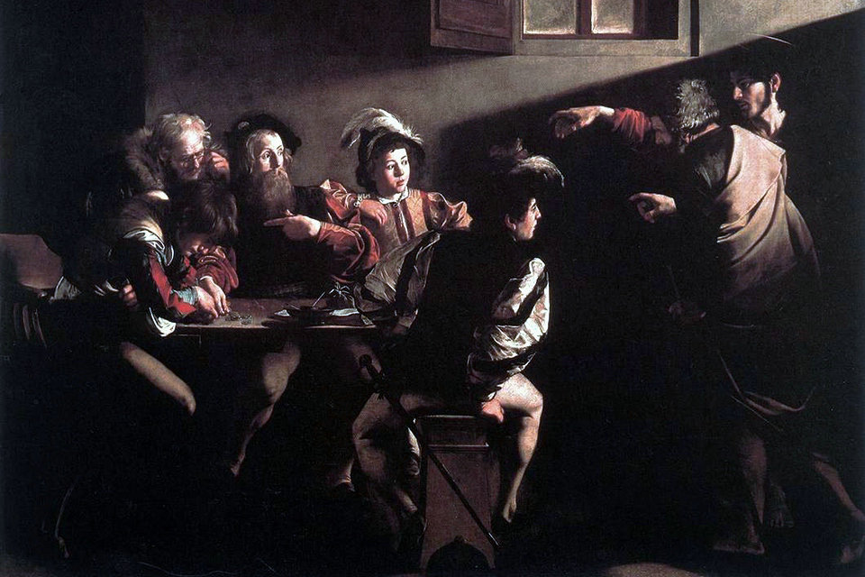
Strong chiaroscuro became a popular effect during the sixteenth century in Mannerism and Baroque art. Divine light continued to illuminate, often rather inadequately, the compositions of Tintoretto, Veronese, and their many followers. The use of dark subjects dramatically lit by a shaft of light from a single constricted and often unseen source, was a compositional device developed by Ugo da Carpi (c. 1455 – c. 1523), Giovanni Baglione (1566–1643), and Caravaggio (1571–1610), the last of whom was crucial in developing the style of tenebrism, where dramatic chiaroscuro becomes a dominant stylistic device.
Baroque Age
Conversely, we speak of tenebrism when light parts immediately rub shoulders with very dark parts without degradation, creating effects of contrasts, and the shadow dominates the whole picture. This is particularly the case in the work of Caravaggio, who will develop the practice in the early xvii th century. The systematization of the most accentuated chiaroscuro has a meaning in Caravaggio’s painting: the terrestrial world is plunged into darkness, in ignorance, while the divine intrusion is signaled by the light on a significant action. This process makes it possible to increase the dramatic tension, to freeze the attitudes at a precise moment, to give the illusion of relief with a strongly marked volume – which testifies to the know-how of the artist.
The Caravaggio, particularly visible in the paintings of the French Valentin de Boulogne, is not to be considered only in terms of light effects, dramatic chiaroscuro . The method that Caravaggio’s follower, Bartolomeo Manfredi, has perfected, takes into account certain privileged subjects, such as groups of musicians in period costumes, painted at the scale of one (1/1), in close-up view, etc. Some Dutch painters who made the trip to Italy, and who are gathered in a school in Utrecht, Honthorst, ter Brugghen, Baburen, have adopted this method. In Flanders, the phenomenon is more limited and interpreted with much greater freedom because these artists did not make the trip to Italy, apart from Louis Finson, but who spent most of his career in Italy and then in France.. The most famous artist of these Flemings today being Jordaens, but he is very distant from Caravagism. A distant wave will arrive, but in a more complex and diffuse way as far as Jan Lievens and Rembrandt, or even Vermeer. But all of these artists obviously practice chiaroscuro, like all their contemporaries.
Classical period
Like most concepts in painting, chiaroscuro is the subject of bitter discussion in France. The classic French condemns the contrasts of Caravaggio, because they interfere with the presentation of a noble form, perfect. In 1765, Diderot, as well as Watelet, defined chiaroscuro as a technical and aesthetic problem: “the fair distribution of shadows and lights”. He disapproves of “light effects”, and extols a “graduated distribution”, and the “truth of lights”. Chiaroscuro, in a landscape, includes atmospheric perspective; in the portrait, he creates the illusion of volume.
17th and 18th centuries
Tenebrism was especially practiced in Spain and the Spanish-ruled Kingdom of Naples, by Jusepe de Ribera and his followers. Adam Elsheimer (1578–1610), a German artist living in Rome, produced several night scenes lit mainly by fire, and sometimes moonlight. Unlike Caravaggio’s, his dark areas contain very subtle detail and interest. The influences of Caravaggio and Elsheimer were strong on Peter Paul Rubens, who exploited their respective approaches to tenebrosity for dramatic effect in paintings such as The Raising of the Cross (1610–1611). Artemisia Gentileschi (1593–1656), a Baroque artist who was a follower of Caravaggio, was also an outstanding exponent of tenebrism and chiaroscuro.
A particular genre that developed was the nocturnal scene lit by candlelight, which looked back to earlier northern artists such as Geertgen tot Sint Jans and more immediately, to the innovations of Caravaggio and Elsheimer. This theme played out with many artists from the Low Countries in the first few decades of the seventeenth century, where it became associated with the Utrecht Caravaggisti such as Gerrit van Honthorst and Dirck van Baburen, and with Flemish Baroque painters such as Jacob Jordaens. Rembrandt van Rijn’s (1606–1669) early works from the 1620s also adopted the single-candle light source. The nocturnal candle-lit scene re-emerged in the Dutch Republic in the mid-seventeenth century on a smaller scale in the works of fijnschilders such as Gerrit Dou and Gottfried Schalken.
Rembrandt’s own interest in effects of darkness shifted in his mature works. He relied less on the sharp contrasts of light and dark that marked the Italian influences of the earlier generation, a factor found in his mid-seventeenth-century etchings. In that medium he shared many similarities with his contemporary in Italy, Giovanni Benedetto Castiglione, whose work in printmaking led him to invent the monotype.
Outside the Low Countries, artists such as Georges de La Tour and Trophime Bigot in France and Joseph Wright of Derby in England, carried on with such strong, but graduated, candlelight chiaroscuro. Watteau used a gentle chiaroscuro in the leafy backgrounds of his fêtes galantes, and this was continued in paintings by many French artists, notably Fragonard. At the end of the century Fuseli and others used a heavier chiaroscuro for romantic effect, as did Delacroix and others in the nineteenth century.
Photography xix th and xx th century
The photograph, as soon as it is in focus, around 1850, is only chiaroscuro. This phenomenon is reproduced up to the pictorialists who will enjoy producing effects close to painting and drawing. Their method consists in playing with all the possible parameters of the photographic device: the camera and its lens, the light in relation to the framed subject, the photosensitive papers and components, the laboratory work and the always possible retouching. Alfred Stieglitz was one of the great promoters of this practice of photography. But his Entrepontmanifests a classic chiaroscuro, all in nuances. Photography enters modernity through the clear expression of the social situation in the choice of framing and with the clear part of the upper deck reserved for wealthy travelers, and the lower deck and its dark areas, reserved for destitute migrants. Therefore, it is not excluded to try to make the chiaroscuro disappear, with extreme contrasts.
The backlight, in the portrait of Rodin by Edward Steichen, reserves the chiaroscuro in the background, on which the figure stands out in a totally black silhouette. Paul Strand (Wall Street. New York City [1915]), and more still Walker Evans, in his views of facades, around 1929, are two good exceptional examples where chiaroscuro has been almost completely eliminated. The Polaroids by Andy Warhol and operation of painting pictures by screen printing part of the same process that eliminates the shades of chiaroscuro, keeping only the flat tints of color or black, united.
As for Degas, the photographer, in his photographs, his portraits cannot be compared to pictorialist portraits, “his chiaroscuro seem to announce the portraits made by Edward Steichen, around 1900-1905”.
Painting xix th and xx th century
The question of the representation of light and shadow has found other solutions in modern art with the paintings of the impressionists and post-impressionists who exploit the tonal value of colors. We have also modernized old solutions, such as when Franz Marc applies an arbitrary color to the shape he represents and simplifies the representation of the model. This has been done before, in Giotto’s painting, for example, but while Giotto eventually used another color, depending on his tonal value, Marc simply uses the same color, which is more “dark” while still remaining “ pure ”.
Application
The French use of the term, clair-obscur, was introduced by the seventeenth-century art-critic Roger de Piles in the course of a famous argument (Débat sur le coloris), on the relative merits of drawing and colour in painting (his Dialogues sur le coloris, 1673, was a key contribution to the Débat).
In English, the Italian term has been used since at least the late seventeenth century. The term is less frequently used of art after the late nineteenth century, although the Expressionist and other modern movements make great use of the effect.
Especially since the strong twentieth-century rise in the reputation of Caravaggio, in non-specialist use the term is mainly used for strong chiaroscuro effects such as his, or Rembrandt’s. As the Tate puts it: “Chiaroscuro is generally only remarked upon when it is a particularly prominent feature of the work, usually when the artist is using extreme contrasts of light and shade”. Photography and cinema also have adopted the term. For the history of the term, see René Verbraeken, Clair-obscur, histoire d’un mot (Nogent-le-Roi, 1979).
Tenebrismo
The style called tenebrism is nothing more than a radical application of chiaroscuro by which only the thematically central figures stand out illuminated from a generally dark background. It is not known whether, due to the influence of Caravaggio or due to a parallel development, the style would become very important in Spanish painting of the late 16th and early 17th centuries from the work of the Catalan Francisco Ribalta. Ribalta would use color and light to give volume to the figures and to highlight the actors in his religious frescoes, some of great beauty; talented teacher, his style would influence that of his son Juan Ribalta, who died early, and Vicente Castelló. Indirectly it would also weigh on Zurbarán and on the most prominent of the Spanish tenebristas, José de Ribera; the latter would bring the style to maturity, using shadowed volumes to reinforce the horror and cruelty of these themes.
In the drawing
The chiaroscuro in the strict sense is linked to graphic art, and is technically the next step to linear drawing. Sometimes the temporal relationship between the drawing of lines and lights / shadows can be reversed, starting with the latter.
Through the chiaroscuro it is possible to give an idea of volumes, materials, space. There are various techniques, ranging from those that allow the sign to be seen (hatching, solid lines, etc.) to those that make it invisible (shading, gradual passages, etc.). The chiaroscuro can only be applied by painting the shadows, with one or more colors (charcoal, sanguine, etc.) or by lightening the lights with respect to the color of the support. The drafting of lights is called “highlighting” and can be done, for example, by using a white crayon on an ocher sheet.
In painting
In painting, chiaroscuro is linked to the use of colors.
Used in ancient painting, it lost its importance in Byzantine and medieval art, where the symbolism of the figures did not require a plastic-spatial relief. To create effects of light and shadow, at most a hatching was used, with a more or less fine grain.
In Italy, at the end of the 13th century, Cimabue revived the use of the most delicate shades, rediscovering the problem of light and the way in which it illuminates the different parts of a body, materials and disparate surfaces in different ways. A masterpiece in this sense was the Crucifix of Santa Croce. With Giotto the chromatic range of shades became wider, coming to resemble more and more the real light. Later painters developed these techniques, making chiaroscuro an essential element of pictorial representation until the nineteenth century. Since that time the Impressionists first (linked to a painting of pure light and color) and the Cubiststhen (who rediscovered flat and geometric shapes) led to an overcoming of chiaroscuro: Matisse for example did without it completely.
In sculpture and architecture
In a more general sense we speak of chiaroscuro, meaning the play of light and shadow that is produced on the surfaces. For example, in architecture we speak of chiaroscuro when the play of full and empty volumes creates an effect of variation with respect to the monotony of a flat surface. An example of a building with chiaroscuro values is the exterior of the Modena Cathedral, with the false loggias created solely for the purpose of moving the façade and sides.
Also in sculpture we speak of chiaroscuro when the relief generates a contrast between light and natural shadow, which can perhaps make the figures stand out and bring out some details. The chiaroscuro is a fundamental element when one wants to represent movement in sculpture; indeed the stronger the effects of lights and shadows, the more tumultuous the scene will be. Among the best known examples there may be the sarcophagus of Portonaccio of ‘ Roman art, the Massacre of the Innocents of St. Andrew the pulpit of Giovanni Pisano, or the Battle of the Centaurs by Michelangelo.
Other arts
The chiaroscuro technique was popular with engravers as well as painting, but would fall into disuse for a long period. It would reach reborn popularity in cinema of the first half of the 20th century, through the taste for markedly structured compositions and the shocking makeup of German expressionism; although some plastic works Expressionists had come to it to enhance the effect of their subjects -in pictures like Klosterneuburg of Egon Schiele or the portrait of Adolf Loos by Oskar Kokoschka-, the use of chiaroscuro in the cinema was largely an original development, which was used to solve the technical limitations of the film and the lack of sound, which required a strong visual stylization to compensate.
The German expressionism would short – lived but influential works would like Nosferatu, eine Symphonie des Grauens of FW Murnau, in which the chiaroscuro plays a central role. The transfer of many German filmmakers to the United States as a consequence of the rise of Nazism would lead to the development of a film genre that combined the narrative conventions of American crime fiction with the visual influence of Expressionism: film noir.. Characterized by the use of unusual proportions of shadow (up to 90% of the screen, against the conventional 50% to 60%) and the use of it as a dramatic artifice – either by darkening elements in a suggestive way, or by bringing to the screen the silhouette of an invisible object — film noir used chiaroscuro as a visual medium to develop the moral ambiguity of its themes. In films like The Maltese Falcon, The Night of the Hunter or Touch of Evil in the United States, or Pepé le Moko in France, the play of light and shadow was one of the main elements of the aesthetic.
Cinema and photography
Chiaroscuro also is used in cinematography to indicate extreme low key and high-contrast lighting to create distinct areas of light and darkness in films, especially in black and white films. Classic examples are The Cabinet of Dr. Caligari (1920), Nosferatu (1922), Metropolis (1927) The Hunchback of Notre Dame (1939), The Devil and Daniel Webster (1941), and the black and white scenes in Andrei Tarkovsky’s Stalker (1979).
For example, in Metropolis, chiaroscuro lighting is used to create contrast between light and dark mise-en-scene and figures. The effect of this is primarily to highlight the differences between the capitalist elite and the workers.
In photography, chiaroscuro can be achieved with the use of “Rembrandt lighting”. In more highly developed photographic processes, this technique also may be termed “ambient/natural lighting”, although when done so for the effect, the look is artificial and not generally documentary in nature. In particular, Bill Henson along with others, such as W. Eugene Smith, Josef Koudelka, Garry Winogrand, Lothar Wolleh, Annie Leibovitz, Floria Sigismondi, and Ralph Gibson may be considered some of the modern masters of chiaroscuro in documentary photography.
Perhaps the most direct intended use of chiaroscuro in filmmaking would be Stanley Kubrick’s 1975 film Barry Lyndon. When informed that no lens currently had a wide enough aperture to shoot a costume drama set in grand palaces using only candlelight, Kubrick bought and retrofitted a special lens for these purposes: a modified Mitchell BNC camera and a Zeiss lens manufactured for the rigors of space photography, with a maximum aperture of f/.7. The naturally unaugmented lighting situations in the film exemplified low-key, natural lighting in filmwork at its most extreme outside of the Eastern European/Soviet filmmaking tradition (itself exemplified by the harsh low-key lighting style employed by Soviet filmmaker Sergei Eisenstein).
Sven Nykvist, the longtime collaborator of Ingmar Bergman, also informed much of his photography with chiaroscuro realism, as did Gregg Toland, who influenced such cinematographers as László Kovács, Vilmos Zsigmond, and Vittorio Storaro with his use of deep and selective focus augmented with strong horizon-level key lighting penetrating through windows and doorways. Much of the celebrated film noir tradition relies on techniques Toland perfected in the early thirties that are related to chiaroscuro (though high-key lighting, stage lighting, frontal lighting, and other effects are interspersed in ways that diminish the chiaroscuro claim).