Gray is an intermediate color between black and white. It is a neutral or achromatic color, meaning literally that it is a color “without color.” It is the color of a cloud-covered sky, of ash and of lead.
The first recorded use of grey as a color name in the English language was in AD 700. Grey is the dominant spelling in European and Commonwealth English, although gray remained in common usage in the UK until the second half of the 20th century. Gray has been the preferred American spelling since approximately 1825, although grey is an accepted variant.
In Europe and the United States, surveys show that grey is the color most commonly associated with neutrality, conformity, boredom, uncertainty, old age, indifference, and modesty. Only one percent of respondents chose it as their favorite color.
In history and art
Antiquity through the Middle Ages
In antiquity and the Middle Ages, grey was the color of undyed wool, and thus was the color most commonly worn by peasants and the poor. It was also the color worn by monks of the Franciscan order, Cistercian Order and the Capucine Order as a symbol of their vows of humility and poverty. Franciscan monks in England and Scotland were commonly known as the grey friars, and that name is now attached to many places in Great Britain.
Renaissance and the Baroque
During the Renaissance and the Baroque, grey began to play an important role in fashion and art. Black became the most popular color of the nobility, particularly in Italy, France, and Spain, and grey and white were harmonious with it.
Grey was also frequently used for the drawing of oil paintings, a technique called grisaille. The painting would first be composed in grey and white, and then the colors, made with thin transparent glazes, would be added on top. The grisaille beneath would provide the shading, visible through the layers of color. Sometimes the grisaille was simply left uncovered, giving the appearance of carved stone.
Grey was a particularly good background color for gold and for skin tones. It became the most common background for the portraits of Rembrandt Van Rijn and for many of the paintings of El Greco, who used it to highlight the faces and costumes of the central figures. The palette of Rembrandt was composed almost entirely of somber colors. He composed his warm greys out of black pigments made from charcoal or burnt animal bones, mixed with lead white or a white made of lime, which he warmed with a little red lake color from cochineal or madder. In one painting, the portrait of Margaretha de Geer (1661), one part of a grey wall in the background is painted with a layer of dark brown over a layer of orange, red, and yellow earths, mixed with ivory black and some lead white. Over this he put an additional layer of glaze made of mixture of blue smalt, red ochre, and yellow lake. Using these ingredients and many others, he made greys which had, according to art historian Philip Ball, “an incredible subtlety of pigmentation.” The warm, dark and rich greys and browns served to emphasize the golden light on the faces in the paintings.
Eighteenth and nineteenth centuries
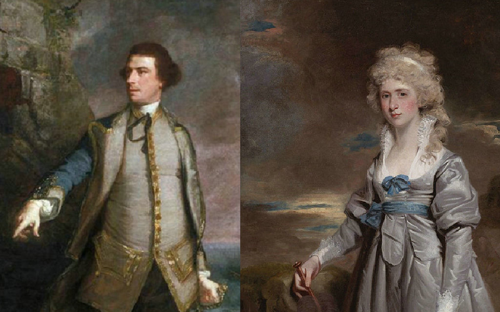
Grey became a highly fashionable color in the 18th century, both for women’s dresses and for men’s waistcoats and coats. It looked particularly luminous coloring the silk and satin fabrics worn by the nobility and wealthy.
Women’s fashion in the 19th century was dominated by Paris, while men’s fashion was set by London. The grey business suit appeared in the mid-19th century in London; light grey in summer, dark grey in winter; replacing the more colorful palette of men’s clothing early in the century.
The clothing of women working in the factories and workshops of Paris in the 19th century was usually grey. This gave them the name of grisettes. “Gris” or grey also meant drunk, and the name “grisette” was also given to the lower class of Parisian prostitutes.
Grey also became a common color for military uniforms; in an age of rifles with longer range, soldiers in grey were less visible as targets than those in blue or red. Grey was the color of the uniforms of the Confederate Army during the American Civil War, and of the Prussian Army during the Franco-German War of 1870.
Several artists of the mid-19th century used different tones of grey to create memorable paintings; Jean-Baptiste-Camille Corot used tones of green-grey and blue grey to give harmony to his landscapes, and James McNeill Whistler created a special grey for the background of the portrait of his mother, and for his own self-portrait.
Whistler’s arrangement of different tones of grey had an effect on the world of music, on the French composer Claude Debussy. In 1894, Debussy wrote to violinist Eugène Ysaÿe describing his Nocturnes as “an experiment in the different combinations that can be obtained from one color – what a study in grey would be in painting.”
Twentieth and twenty-first centuries
In the late 1930s, grey became a symbol of industrialization and war. It was the dominant color of Pablo Picasso’s celebrated painting about the horrors of the Spanish Civil War, Guernica.
After the war, the grey business suit became a metaphor for uniformity of thought, popularized in such books as The Man in the Gray Flannel Suit (1955), which became a successful film in 1956.
Source From Wikipedia