
The aerial perspective and atmospheric perspective is the method with which one occurs sense of depth in a painting, to imitate the effects of space that makes objects look more pale, blue and hazy or less distinguishable distance middle and far.
The aerial perspective, atmospheric perspective or view of appearance is a pictorial technique consists in marking the depth of the space by the progressive gradation of colors and the gradual softening contours. It applies almost exclusively to the landscape.
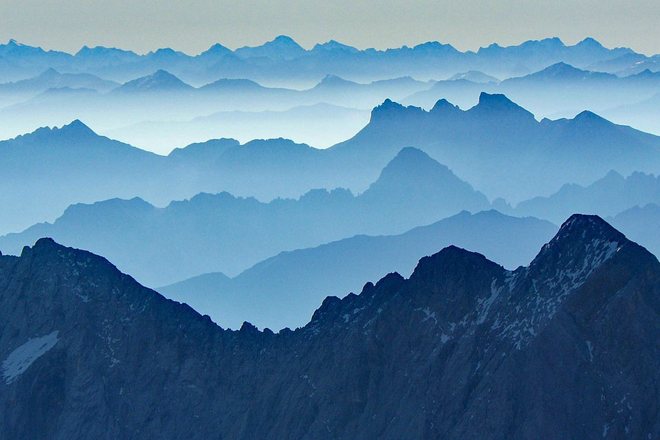
Some artistic currents have estimated that the aerial perspective is reduced exclusively or mainly to the chromatic perspective, which is the predominance of colors drawing towards blue in the distance.
Leonardo da Vinci
The term was coined by Leonardo da Vinci, but the technique may have already been used in the ancient Greco-Roman wall paintings of Pompeii. It was discovered that dust and humidity in the environment caused the dispersion of luminosity; the short wavelength light (blue) being more scattered and the long wavelength light (roa) less scattered.
The Italian painters of Leonardo’s times used the procedure; being taken advantage of in the fifteenth century by northern European artists and then by Joseph Mallord William Turner.
In art, especially painting, aerial perspective refers to the technique of creating an illusion of depth by depicting distant objects as paler, less detailed, and usually bluer than near objects.
Since the High Renaissance, the artists have used the aerial and color perspective in addition to the central perspective to represent the depth space. They want to credibly reflect the visible reality. Leonardo da Vinci recognizes that the distant blueness and paleness comes from the medium of air. He is probably the first to describe this phenomenon as an aerial perspective.
The aerial perspective, whose studies were started mainly by Leonardo da Vinci, is based on the discovery that air is not a completely transparent medium, but with increasing distance from the observation point, the contours become more nuanced, the colorsless and less clear and their range tending towards blue. Leonardo consequently in his painting makes objects with colors more and more nuanced according to their distance, making those in the foreground sharper. In fact, Leonardo tends to further distinguish an “aerial perspective” proper, in which the gradient is applied according to the distance of the objects depicted, from a “color perspective” which instead theorises the change of color of things due to their distance.
Furthermore, according to Leonardo’s optical studies, the air is denser (« one air thicker than the others ») the closer it is to the ground, while it becomes more transparent with height. So above all the landscape elements that develop in height, such as the mountains, appear sharper in the higher parts.
” Therefore you, painter, when you make the mountains, always make the basenesses from hill to hill clearer than the heights, and what you want to do further away from each other, make the baseness lighter; and the higher it rises, the more it will show the truth of form and color ” (manuscript A, dating back to around 1492, sheet 98 recto).
Among the works often brought as examples of application of the aerial perspective there are three pictures of Leonardo’s maturity: the Mona Lisa, The Annunciation, the Virgin with Saint Anne and the Child and the Virgin of the Rocks (Paris). This technique was also used by Piero della Francesca in the landscape of the Double portrait of the Dukes of Urbino.
«Of the air that shows the roots of the mountains more clearly than their tops.
The tops of the mountains will prove increasingly darker than their bases. This happens because these mountain tops penetrate into thinner air that does not make their bases, according to the second of the first that says, that that region of air will be all the more transparent and thin, as it is more remote from the water and from the earth; so followed, these mountain peaks that reach thin air in it prove more of their natural darkness than those that penetrate the low air, which, as is proven, is much larger.
Because the more distant the trees from a distance in, the more they light up.
From a distance the trees, the further away they are from the eye, the more clear they are, since the last are the clarity of the air in the horizon. This arises from the air interposed between them trees and the eye, which being of white quality, as much as it intervenes, of much greater whiteness occupies them trees, which to participate in themselves of dark color, the whiteness of this interposed air makes the dark parts more blue than their illuminated parts. ”
Aerial perspective painting
The watercolors of Albrecht Dürer’s second trip to Italy are proof of the artist’s trust in the visual impression. He paints distant mountains in light blue, although in truth (ie nearby) they have the colors of the forest, stone or snow.
The Dutch baroque painters in particular consistently classify their landscapes from warm to cold. They use warm brown, red and yellow in the foreground, a cold steel blue in the background and green gradations in the middle between the two.
Romantic painters put feeling and internalized nature experience against the sobriety and rigor of classicism. They are increasingly turning to landscape painting. The aerial perspective plays a major role in representing the feeling of loneliness and the longing for the distance.
From the Renaissance onwards, the aerial, color and central perspective remained unchallenged until Impressionism. Since then, artists have also used multi-perspective and perspective perspectives.
Aerial perspective
Teacher landscape painting at the end of the xviii th century, PH Valenciennes down rendering of space or perspective, linear perspective, which determines lines and aerial perspective, which determines color. It follows a well-established custom since Girard Desargues, who had thus divided his treaty of 1648. In 1732, The Dictionary of Thomas Corneille summarizes: “In addition to lineal or linear perspective that teaches, as we have said, lower lines, Painters observe aerial perspective, which consists in the reduction of hues and colors, according to the more or less distance from objects”.
The perspective of appearance was rediscovered at different times, the frescoes of Pompeii show that they were used in antiquity.
In the 19th century, the artists of the Barbizon School and the following currents interested in landscape and lighting effects are diligently practicing aerial perspective. At the same time, the effect of distance on shapes and colors was the subject of scientific investigation. In 1791, Watelet considered that aerial perspective “is not subject to rigorously demonstrated principles” and that “it is above all by observation that the artist will learn the laws of aerial perspective”. The primacy of human observation remains a basis of art, century, von Brücke and Helmholtz tackle the subject from a scientific point of view in the Scientific Principles of Fine Arts. Several other scientists like Rayleigh will provide scientific studies on the scattering of light in the atmosphere, responsible for the color of the sky.
An artist can apply both linear and aerial perspective to the same painting, as well as using only one or the other. The French painters of the xviii th century, as the classical Chinese painters were very attentive to the aerial perspective.
Chromatic perspective
For certain artistic teachings, the distance is marked by bluish colors. In many paintings like The Virgin of the Rocks or the Mona Lisa, Leonardo da Vinci paints the distant bluer than the closer shots.
Goethe says: “It is certain that the atmospheric perspective depends on the doctrine of troubled environments. The sky and distant objects, the close shadows seem blue to us; the shiny and resplendent objects offer us nuances which can vary from yellow to purple red; in many cases, the colors are such for our eyes, that a colorless landscape, thanks to the well observed conditions of the clear and the obscure, can appear to us strongly colored”. This is what Valenciennes disputes:“There is not, on the objects of Nature, of fleeting color, nor which advances more than another, if it is not that which takes part most in the aerial color (…) An object whose color is red, placed at a very great distance from our eye, remains at this distance, in spite of its strong and decided color: in truth, this color is extremely weakened by the interposition of the terrestrial vapors which are between this object and our eye, and which establish a very great difference from this color to the same which would be placed on the front of the picture. It is by making this vapor more or less feel, that we advance or retract the object”.
The fact remains that experimental psychology recognizes prominent and fleeting colors. If a colored disc is placed on a gray background, the subject identifies it as a dot on the background, if it is red or pink, but as a hole towards another background, if it is blue. There is a certain skill for the artist to use this effect, painting blue the hollows and the distant ones. Modern art, after Cézanne, will make this property a basis for composition, going from modeling to modulation.
Annexes
Aerial perspective and atmospheric perspective are interchangeable, the first being more frequently in the source from the 17th century, while some authors as the learned Hermann von Helmholtz prefer second attested only 19th century. The slightly heavier expression has the advantage of avoiding any ambiguity. At the end of the 18th century century, the processes of linear perspective are taught in order to paint vertical paintings. The principles are the same, but the methods differ for painted ceilings. The latter often represent celestial, spiritual or divine creatures. The aerial perspective has nothing to do with these aerial beings.
The chromatic perspective is the part of the subject which concerns the weakening of the colors and the dominant blue of the backgrounds, excluding the decrease in contrast and the confusion of contours: “The aerial perspective is composed of the perspective of clear -dark, and chromatic perspective or colors”.